

")
How much are migrants earning? Not even Jonathan Portes knows
ROBERT COLVILE
One of the worst things about having a public profile is that you tend to attract stalkers. But rarely are those stalkers credentialled academics with a six-figure following on social media.
Back in May, the Centre for Policy Studies – which I run, and which also owns CapX – published a major piece of work on migration by Robert Jenrick, Neil O’Brien and our own Karl Williams. We argued not just that migration was far too high, but that it was far too unselective: we were bringing in far too many low-wage, low-skill individuals (or even people who would not work at all), rather than scouring the world for the best and brightest.
Since then, we have endured a barrage of abuse from Professor Jonathan Portes. He insists that the new wave of arrivals are mostly higher earners who will benefit the British economy – which is why, in his view, people shouldn’t be nearly as worried as they are about the scale of the numbers arriving. He’s called our findings (and/or our staff) innumerate, absurd, spurious, laughably incompetent and obvious bullshit. He’s put snarky little quote marks around the words ‘research’ and ‘think tank’.
As with so many online obsessives, I’d decided that the best policy was just to ignore him, not least since Portes has also made serious and repeated misrepresentations about the contents of the paper in question.
But the root cause of our dispute speaks to a hugely important public policy issue – also addressed by the official Migration Advisory Committee in a new report this week. Namely, how much are migrants actually earning? And how can you actually tell?
And in investigating this issue, you come up against another, even bigger problem: that we don’t know nearly enough about who is in the country, and what they are doing.
But let’s start at the beginning.
As we all know, there has been an astonishing and unprecedented rise in legal migration in the last few years.
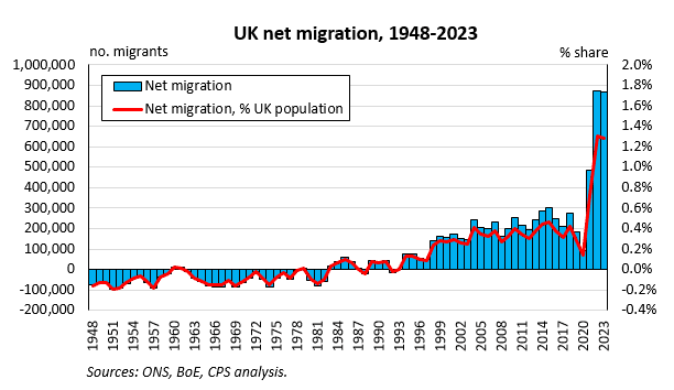
As we argued in ‘Taking Back Control’, the change isn’t just to the scale of migration, but its nature. The OBR recently produced estimates of the financial impacts of high-wage and low-wage workers – only to admit that a spreadsheet error had seen it underestimate both the contribution of higher earners and the costs of those on low wages. Its corrected figures show that the typical low-wage migrant will end up costing the Treasury over £1.5 million across their life – almost £500,000 more than the first version.

If we at the CPS are right about how many migrants are on low wages, then we are letting in too many people who will be on or near that yellow line, and need to be much more selective. If we’re wrong, as Prof Portes has vociferously suggested, then the benefits to the economy from migration are clearer (though we still have to worry about the wider impacts – as per our recent estimate that we would have had to raise housing targets in England by 800,000 to keep up with net migration in the last four years, when of course we didn’t come anywhere near the targets we already had).
So how many migrants are actually working?
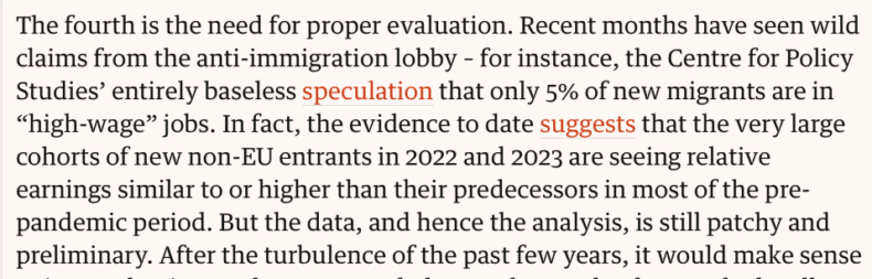
In a recent Guardian piece, Prof Portes said, in his typically courteous way, that our estimate that only 5% of migrants in the post-2020 cohorts are in high-wage jobs was ‘entirely baseless speculation’, and that ‘the very large cohorts of new non-EU entrants… are seeing relative earnings similar to or higher than their predecessors’.
But this was a sneaky little trick. As Prof Portes well knows, a shockingly small proportion of visas in the last few years have been for workers, let alone skilled ones.
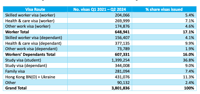
From the start of 2021 (when the new immigration system came into operation) until June this year, only 5.4% of visas were for the normal skilled worker route, with another 7.1% for the skilled worker (health and care) route. There were also a further 4.6% on two dozen different niche and legacy work routes – from investor visas (0.01%) to minister of religion visas (0.05%) and domestic worker visas (1.6%).
But in terms of visas granted, workers have been matched almost 1:1 by the dependants they have brought in. Then there are the large numbers from student migration, the many family reunion visas, and of course the special schemes for Hong Kong, Afghanistan and Ukraine.
Now, some people on non-work visas may well be working – arrivals from Hong Kong or Ukraine, for example, or some or even many of these dependants (see the discussion below of the MAC’s new estimates). Some students may also, as Neil O’Brien has highlighted, be doing work on the side – or, less charitably, doing work as eg Deliveroo riders while studying on the side.
There is also an argument that students will go on to do higher-wage work once they graduate – though actually, as we point out in ‘Taking Back Control’, large numbers appear to be moving into low-paid jobs in social care, or even claiming asylum.
But still. This is the main reason we make such a low estimate of the proportion of high-wage workers: because of the low numbers of workers full stop.
To put it another way, Prof Portes is contrasting our ‘5%’ with ‘very large cohorts’. But only 12% of visas are for skilled workers in the first place! And a solid majority of those are for the social care route, which is dominated (as I explain below) by low-paid care workers.
Which brings us to the second big question – how much are these workers actually earning? And here’s where we bump into an issue that’s bigger even than Jonathan Portes’s ego. Namely, that we have extremely inadequate data on who is in the country, who is in the workforce, and how much they are earning.
Let’s look at that OBR chart again.
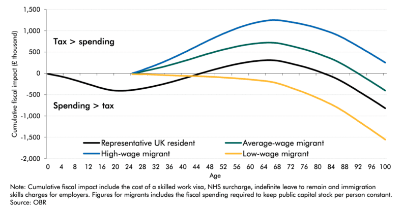
The top line assumes migrants earn 30% more than the average UK resident. The bottom line assumes migrants earn 50% less. These, says the OBR, ‘are broadly in line with the 25th and 75th percentile of migrant earnings, in their first year of arrival, relative to the UK-born average in the ONS Labour Force Survey’.
In other words, a quarter of migrant earners are above the top line, a quarter are below, and the rest are somewhere in between.
This, for Portes, is proof that we are snivelling idiots who can’t read what the OBR says. We say 5% of migrants are high-wage, it’s 25%. We say 60% are low-wage, it’s 25%. The average migrant, he insists, ‘is on average wages’, so is contributing to the economy. In other words, go boil your heads.

Well, no. As mentioned above, our estimates are for *all migrants* under the new system, not just workers. And the OBR explicitly says that its modelling is ignoring dependants and assuming all migrants are just single people with work visas. Given the recent composition of migration, this is not a very helpful assumption.
More seriously, though, we can indeed read. And we can even read footnotes. Because in the very paragraph that Prof Portes keeps endlessly posting as proof that we are idiots, there is a footnote acknowledging that the data underpinning that OBR chart is highly unreliable.

Historically, our main source of information on who is in the workforce, and how much they are earning, is the ONS’s Labour Force Survey (LFS). They get the data from this by, well, asking people.
The problem is that the number of people willing to be asked has been going down – gradually over many years, and then very sharply during the pandemic. There has also been a collapse in the number of in-person interviews, after the ONS suspended its programme of home visits and started relying much more on self-reporting.

As Andrew Sentance pointed out the other day, in an excellent piece for CapX, this is really not good. But it’s not just him saying it. Alarm bells have been ringing in the Treasury and Bank of England. The Resolution Foundation recently estimated that the LFS may have lost more than a million workers.
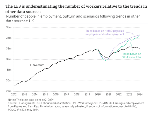
This is playing havoc with our overall estimates of population size, and how many of those people are working. But it’s had a particular impact on migration statistics.
Madeleine Sumption, the director of Oxford University’s Migration Observatory, argues that migrants have been among the groups whose response rates have fallen most sharply. Especially new arrivals in relatively precarious situations, or families who might not have the best English, and will struggle with online surveys or phone polls as opposed to household visits.
Recently, the ONS acknowledged in response to a Freedom of Information request that abandoning household visits ‘led to a significant change in the pool of people who responded to the survey. One very noticeable characteristic of this change in non-response bias was the poor response from migrants, leading to implausible movements in our country of birth and nationality statistics. This led to us suspending our labour market statistics relating to levels of migrants in 2021.’
In other words, the LFS is likely to be under-reporting the proportion of migrants on low wages, or not in the workforce at all. And while this has been exacerbated by the pandemic, it’s a much older problem – in 2015, research commissioned by the official Migration Advisory Committee was pretty scathing about its accuracy.
In short, the reason we don’t agree with the OBR is because the data underpinning that chart is acknowledged by everyone but Jonathan Portes to be hugely unreliable – to the point that it has been downgraded as an official statistic, and a massive programme to create a better labour force metric is now under way (though as Sentance notes, its completion was recently pushed back to 2027, meaning we still face years of uncertainty).
So what other sources of data are there? Well, the other one that Prof Portes has consistently pointed to is a study co-written by… Jonathan Portes (though even he acknowledges that its findings are patchy and provisional).
This uses HMRC data via the PAYE system, and is the source of his claim that non-EU migrants ‘are seeing relative earnings similar to or higher than their predecessors’.
But this, again, is a sneaky little trick. The most obvious shift in the migration system post-Brexit has been a huge swing from EU to non-EU. So even if those non-EU workers are earning more than previous non-EU workers, wages will still have gone down if they are earning less than the EU workers they replaced. Which is exactly what his data seems to suggest.

Of course, as Prof Portes says, average salaries for new arrivals do tend to rapidly climb. But as he also admits, this could be driven by ‘selective out-migration’ rather than a huge improvement in their skills or salaries – in other words, migrants on low wages leave, pushing up the salary average for that cohort, while new migrants on low wages arrive.
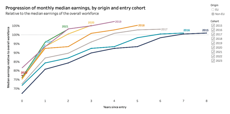
And there is another issue. This data is drawn from the PAYE system. Which means it only counts those in salaried employment. So it misses out anyone who is self-employed, as well as all of those on the ‘Deliveroo visas’ highlighted by Neil O’Brien. Pretty much by definition, it will therefore produce higher earnings figures than the reality.
So what about our alternative? Well, we tried to measure migrant salaries in two different ways – although we have been very, very clear that these are only guesstimates, and that we really need better data.
First, we looked at nationality. People who come here from different countries tend to have very different working patterns – employment rates, salaries, rates of female economic participation etc.

Prof Portes has pointed out, and he’s absolutely right, that the people arriving here from poorer countries are often much wealthier than the average from those countries. That’s why, for example, the average Indian in the UK is paying more tax than the average German.

But still – all other things being equal, and accepting that this methodology is deeply imperfect, taking more people from Somalia and fewer from Spain will probably result in lower salaries and less income for the Treasury. And that’s definitely the direction our migration system has moved in.
But here’s another way of looking at it – which is where our 5% estimate came from.
If you look at the people who are coming here on work visas, what jobs are they coming to do?
Well, if you look at the health and care visa, you will find that in 2023 we let in approximately 9,000 doctors, 22,000 nurses and 105,000 care workers. Care workers, pretty obviously, tend to be paid less than doctors or nurses.
So we ran the numbers for the whole visa system. We found that we aren’t bringing in many bankers, engineers and scientists – or not nearly as many as we’d like. In fact, even of those on skilled worker visas, at least 68% came to occupations where the median salary was less than the UK average.
Now, we freely admit that this is a rough estimate – in fact, Prof Portes has denounced it as ‘made-up’ data.
But this is how we get to our 5% number, on which Prof Portes has fixated. Only 12% of visas are explicitly skilled work visas. Only 32% of those are for jobs which are likely to pay more than the UK average wage. So the overall proportion of visa-holders on above-average wages may be as low as 4%. If we throw in the other miscellaneous work routes, then we get to around 5%.
In the last few days, however, the Migration Advisory Committee has made a pretty big contribution to this debate. Its annual report finds, based on new analysis of the salaries declared to the Home Office by the companies sponsoring visa applications, that those coming in on the skilled worker route made a significant financial contribution to the UK – certainly significantly more than those already here.
Case closed? Prof Portes certainly believes so, judging by the many, many tweets he has since published demanding that the CPS apologises for its idiocy.
But again, the picture isn’t as clear-cut as he is claiming. First, the MAC work is only confined to the Skilled Worker route – so ignores the large majority of visas issued.
Second, the MAC is only providing a snapshot. In fact, it explicitly states that the people it is profiling are very obviously going to come off well, as they are arriving here with jobs to go to, of working age, and are legally barred from claiming access to many benefits. It also makes the generous assumption that 58% of the dependants they bring will also be working – though acknowledges that this is based on Labour Force Survey data, and should hence be treated with extreme caution. (In fact, the MAC is now promising to do more longitudinal work on immigrants’ experiences – something we explicitly called for in ‘Taking Back Control’.)
But the MAC findings also make clear the enormous gap between actual skilled workers, and the many, many lower-skilled workers arriving via the health and care route – which is precisely the point we at the CPS have been belabouring.
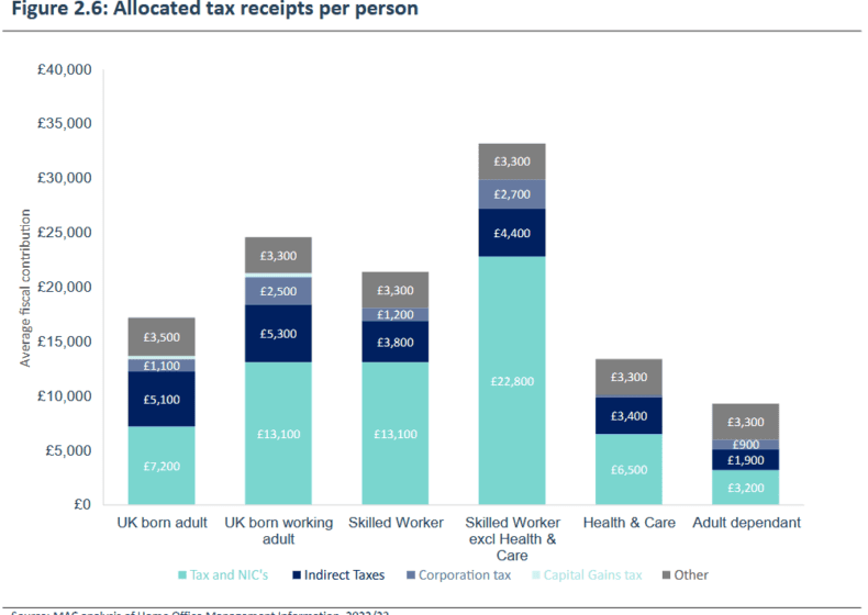
In the screenshot Prof Portes has been endlessly tweeting at us, the MAC compared immigrants’ salaries to the average UK adult. But as the report acknowledges literally four paragraphs later, a better ‘like for like’ comparison is with UK adults who are actually working. On this front, the MAC says that ‘the median salary for UK adults was £28,000 [in the period studied], compared to a median salary for migrants on the [health and care] route of £24,000 and £45,000 for those Skilled Workers outside the H&C route’.
This is a cavernous difference. Those migrants on the skilled visa route who were not on the health and care route were earning almost twice as much as those who were. This is reflected in their tax contributions: an average of £22,800 in income tax and NICs vs just £6,500. And as the MAC pointed out, an extraordinary 60% of ‘skilled worker’ visas were being issued for health and care workers, who were tending to earn – yes – well below the national average.
It’s been a long journey through the data. But before we finish, there are just three more things to look at.
Neil O’Brien recently looked at data on earnings by nationality. He found that average salaries for Indian and Nigerian nationals have cratered in the last few years, and even more so for those aged 22-40. This is consistent with a very large number of lower earners from those countries arriving.
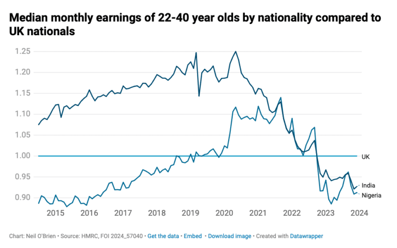
Similarly, Prof Portes’s own paper for the Migration Observatory shows a sudden dip in the average salaries of non-EU migrants in the last couple of years – again consistent with a lot of new arrivals showing up, but not getting paid very much.

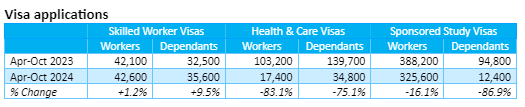
But then, there’s a final puzzle. Starting in April this year, the Government hiked the salary threshold for the skilled worker visa from £26,000 to £38,700, and removed many of the loopholes which saw salary thresholds as low as £21,000. Yet visa applications on the skilled worker route are actually up slightly – 1.2% year on year.
This could mean that many of those arriving on that route were already earning more than the typical salary for those roles, fitting in with Prof Portes’s high-wage thesis. Or it could mean that employers have been misreporting salaries to get people in anyway.
Alternatively, and most encouragingly, it could mean that the new rules on thresholds since April are helping to change the migrant mix in a fiscally positive way – as, indeed, we argued was necessary.
If you look under the bonnet at the occupation codes associated with visas, there are notable increases in applications for e.g. ‘skilled construction and building trades’ (+214%), but big decreases elsewhere.
In particular, on the skilled worker (health and care) route, where the salary threshold is now £29,000 for social care jobs (though even now, there are loopholes which put it as low as £23,200), worker applications are down by 83%, and applications for their dependants by 75%. That suggests that the new rules could be having the intended effect (though the recent MAC report noted that the decline began before the new thresholds came into effect, due in part to UKVI scrutinising applications more carefully). But it also suggests – as we argued – that an awful lot of workers have been coming in on salaries well below the UK average.
The truth is, we don’t yet know which of these explanations is right – precisely because the information we have is so patchy. Indeed, one of the key themes of our work with Jenrick and O’Brien was the need for much, much better data. And it’s great that the MAC has picked up on the same point.
Ever since it came out, Prof Portes has been attacking our paper – not least by repeatedly misrepresenting what it actually said. But I hope this piece explains why I don’t believe that our ‘absurd’, ‘spurious’, ‘terrible’ ‘ramblings’ are the product of ‘laughable incompetence’. We may well still be wrong. But we will be honestly so.
This article (How much are migrants earning? Not even Jonathan Portes knows) was created and published by CAPX and is republished here under “Fair Use” with attribution to the author Robert Colvile
Featured image: simplyflying.com

••••
The Liberty Beacon Project is now expanding at a near exponential rate, and for this we are grateful and excited! But we must also be practical. For 7 years we have not asked for any donations, and have built this project with our own funds as we grew. We are now experiencing ever increasing growing pains due to the large number of websites and projects we represent. So we have just installed donation buttons on our websites and ask that you consider this when you visit them. Nothing is too small. We thank you for all your support and your considerations … (TLB)
••••
Comment Policy: As a privately owned web site, we reserve the right to remove comments that contain spam, advertising, vulgarity, threats of violence, racism, or personal/abusive attacks on other users. This also applies to trolling, the use of more than one alias, or just intentional mischief. Enforcement of this policy is at the discretion of this websites administrators. Repeat offenders may be blocked or permanently banned without prior warning.
••••
Disclaimer: TLB websites contain copyrighted material the use of which has not always been specifically authorized by the copyright owner. We are making such material available to our readers under the provisions of “fair use” in an effort to advance a better understanding of political, health, economic and social issues. The material on this site is distributed without profit to those who have expressed a prior interest in receiving it for research and educational purposes. If you wish to use copyrighted material for purposes other than “fair use” you must request permission from the copyright owner.
••••
Disclaimer: The information and opinions shared are for informational purposes only including, but not limited to, text, graphics, images and other material are not intended as medical advice or instruction. Nothing mentioned is intended to be a substitute for professional medical advice, diagnosis or treatment.
Disclaimer: The views and opinions expressed in this article are those of the author and do not necessarily reflect the official policy or position of The Liberty Beacon Project.


Leave a Reply