


DR. DARKO BUTINA

The latest ONS release of the Annual Death Rates for England and Wales for years 1953-2020 places year 2020 in 22nd place (out of 68 years) and shows that the Covid-19 virus causes FEWER deaths than flu viruses in the previous years.
Below we share with readers official government data to demonstrate that Prime Minister Boris Johnson has no reasonable scientific basis at all to continue with any lockdown measures.
Below we present a graph with an accurate plot of all Office of National Statistics (ONS) data on full annual mortality rates for every year from 1953 to the end of 2020.
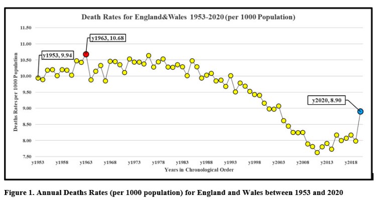
Each Yellow Dot Represents Annual Death Rate Between 1953 And 2020. The Years, X-Axis, Are Plotted In Chronological Order, While The Annual Deaths Rates Are Plotted On The Y-Axis.
When adjusting for the fact that the UK population was only 50 million in 1953 and risen steeply in recent years to over 68 million today!
For all you non-mathematicians out there, to calculate ‘Annual Death Rates’ one needs two parameters:
(1) the number of annual death certificates, and
(2) the size of population for each year.
Then you must take the annual deaths and divide them by the size of population that year and the resulting number multiplied by 1,000 and reported as Annual Death Rates per 1,000 population:
Annual Death Rates (Per 1,000 Population) = ( Annual Death/Annual Population) X 1,000 (1)
The British government has been misleading the general public by being wilfully alarmist. Their ‘experts’ knew full well how to make these calculations, but deliberately did not represent death rates on a like-for-like basis e.g. by calculating deaths per thousand head of population.
The final figures for the Total Weekly Deaths for England and Wales (E&W) were released in the second week of January 2021, followed by the release of historical data later that week which allowed construction of the graph above.
Before we discuss how to interpret and describe the graph in Fig.1 above, let us first look at the sample table which is needed to construct that graph and identify the importance of using the rate of death, rather than just the simple number of deaths.
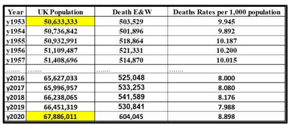
The sample table above consists of 4 columns: Year, UK population, Annual Deaths for England and Wales, E&W, and Death Rates per 1,000 population. The first 5 rows have the numbers for oldest years 1953 to 1957, while the last 5 years are listed at the bottom.
The two numbers highlighted in yellow explain the reasons for NOT using the annual death numbers on their own. If we were to plot annual deaths as a single number, the year 2020 would be described as the deadliest one since 1953, which is exactly what news outlets like BBC has been and still is doing.
However, if you compare the UK population in 1953 to 2020, you will notice that the year 2020 has 17 million more people than 1953 and therefore larger annual deaths rate.
Now that the formula and the reasons for expressing annual deaths rates has been explained, let me tackle the issue of the term ‘annual death for E&W’ upon which the graph in Fig.1 was built.
The main function of the Office for National Statistics, ONS, at www.ons.gov.uk, is to produce annual statistics on the key indicators that define the country’s health and prosperity. The three most important annual numbers for any country are the size of Population, the Natality, and the Mortality Rates, which can be calculated only after the total number of the birth and deaths certificates have been published.
The key word here is annual as the time unit for comparison between years.
In other words, it is only possible to produce annual statistics for a given year in the year after, once all the relevant numbers have been compiled!
The two numbers needed to calculate the death rates for the 2020 UK population was announced in June 2020, while the total weekly deaths for E&W were published in 2nd week of 2021.
The annual death numbers for E&W are obtained by adding up the ONS database field called ‘Total Deaths, all ages and all causes’ that is reported for each week of the year. Please note, that the extra week in leap years, week no 53, is ignored in order to allow direct comparison between the leap and non-leap years.
The last part of the puzzle missing to solve the discrepancy between the frenzy of reporting Covid-related death is to understand what the numbers quoted as the annual death mean and how they were obtained.
The total annual deaths numbers are obtained by simply counting the number of death certificates that have been issued in any given year. What any government needs is to simply compare annual numbers of death certificates and birth certificates, divide those numbers by the annual population and use two key parameters – death and natality rates – to plan for the future in terms of schools, jobs, and hospitals.
Let Us Now Analyse Fig.1 And Explain What The Annual Deaths Rates For Years 1953 to 2020 Are Telling Us, And Offer An Explanation Why This Graph Is In Total Contrast With The Fake News Media Reports Which State, ‘Covid-19 Deaths Never Seen In Our Lifetime’ Or ‘Since Spanish Flu In 1918’.
Let us start with re-iterating the fact that the annual death rates are based on the number of deaths certificates only, so that any attempt to ‘extract’ some additional information, like cause of death, the information that is not there, is nonsensical.
What is obviously the first shock in looking at the chronological annual deaths rates, which do not lie, is the fact that
- All the years between 1953 and 2003 had annual deaths rates higher than 2020
- The major flu epidemic years of 1957, 1968 and 1999 have the higher death rates than Covid year 2020
- The only possible interpretation of those historical facts is that the Covid-19 is just another flu virus that is less deadly than the previous flu viruses
- It must follow that the number of deaths claimed to be caused by the Covid-19 virus are result of the computational models with 0% accuracy and developed by the discredited scientists
- It must also follow that the decision to invoke Martial law on the whole of the UK population had a sole purpose of testing the accuracy of prediction of those models
This now raises a question that the government has to answer: What possible information did the government have in March 2020 that justified the first lockdown of 66 million people?
If we look at the graph, the year 1963 had the highest deaths rate since 1953, while the preceding 2019 had one of the lowest rates.
So, again, what was a trigger, which should have been based on some scientific facts, in March 2020 when the annual death rate for the UK population was NOT known?
Since the weekly total deaths numbers do not have any additional information about the causes of death, it must follow that the decision to announce the first lockdown must have been based on some speculative and extremely simplistic models and as we know now, they had 0% accuracy.
The sole purpose of this report is to present the first analysis of the annual deaths rates for E&W after annual numbers for 2020 became available and allowed a direct comparison with the historical data going back to 1953.
One point to emphasise here is that the annual mortality rates would detect any cataclysmic deaths event, which would increase death certificates numbers by say, 20%, but more on this topic in another report.
The more detailed analysis of Covid-19 genesis will be published soon, but let me finish this report with a few important statements:
- The medical definition describing flu is that flu does not kill, but it can cause death indirectly by affecting people with pre-existing health problems
- The weekly death numbers for week 16 and 17 (in April) are the highest recorded since 1999, but not if the population of 2020 is considered (get your numbers straight BBC!)
- I am grateful to the Office for National Statistics for free access to their database and the links to the source of data used in this report can be found under References
Let us return to some sort of sanity and finish by recognising the fact that for 1.00% of those who die (600,000), 99% do survive (66,000,000):

The only difference between the two pie charts in Fig.2 is that the people who lived or died between 1953 and 2019 have been free to socialise, travel, go to schools, universities and to work. In contrast, all of us who survived in 2020 are still imprisoned in our homes while nothing has been altered in terms of annual mortality rates since 1953!
Links to datasets on www.ons.gov.uk :
*************
Source
About the author: Dr Darko Butina is retired scientist with 20 years of experience in experimental carbon-based chemistry in drug discovery and 20 years of experience of modelling data generated by calibrated instruments and various biological screens. Since 2010, he published 3 papers analysing daily temperature patterns across the globe, with 3 more coming out in next 2-3 months. He also runs his own webpage at www.l4patterns.com.
Published to The Liberty Beacon from EuropeReloaded.com

••••
The Liberty Beacon Project is now expanding at a near exponential rate, and for this we are grateful and excited! But we must also be practical. For 7 years we have not asked for any donations, and have built this project with our own funds as we grew. We are now experiencing ever increasing growing pains due to the large number of websites and projects we represent. So we have just installed donation buttons on our websites and ask that you consider this when you visit them. Nothing is too small. We thank you for all your support and your considerations … (TLB)
••••
Comment Policy: As a privately owned web site, we reserve the right to remove comments that contain spam, advertising, vulgarity, threats of violence, racism, or personal/abusive attacks on other users. This also applies to trolling, the use of more than one alias, or just intentional mischief. Enforcement of this policy is at the discretion of this websites administrators. Repeat offenders may be blocked or permanently banned without prior warning.
••••
Disclaimer: TLB websites contain copyrighted material the use of which has not always been specifically authorized by the copyright owner. We are making such material available to our readers under the provisions of “fair use” in an effort to advance a better understanding of political, health, economic and social issues. The material on this site is distributed without profit to those who have expressed a prior interest in receiving it for research and educational purposes. If you wish to use copyrighted material for purposes other than “fair use” you must request permission from the copyright owner.
••••
Disclaimer: The information and opinions shared are for informational purposes only including, but not limited to, text, graphics, images and other material are not intended as medical advice or instruction. Nothing mentioned is intended to be a substitute for professional medical advice, diagnosis or treatment.


Leave a Reply